13th June 2025 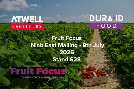
See us at Fruit Focus 2025
We are delighted to be exhibiting at Fruit Focus 2025 hosted at Niab East Malling on the 9th July 2025. Find us on stand 628...
We are delighted to be exhibiting at Fruit Focus 2025 hosted at Niab East Malling on the 9th July 2025. Find us on stand 628...

Today, we are sharing the top things to look for when purchasing a new labelling machine.
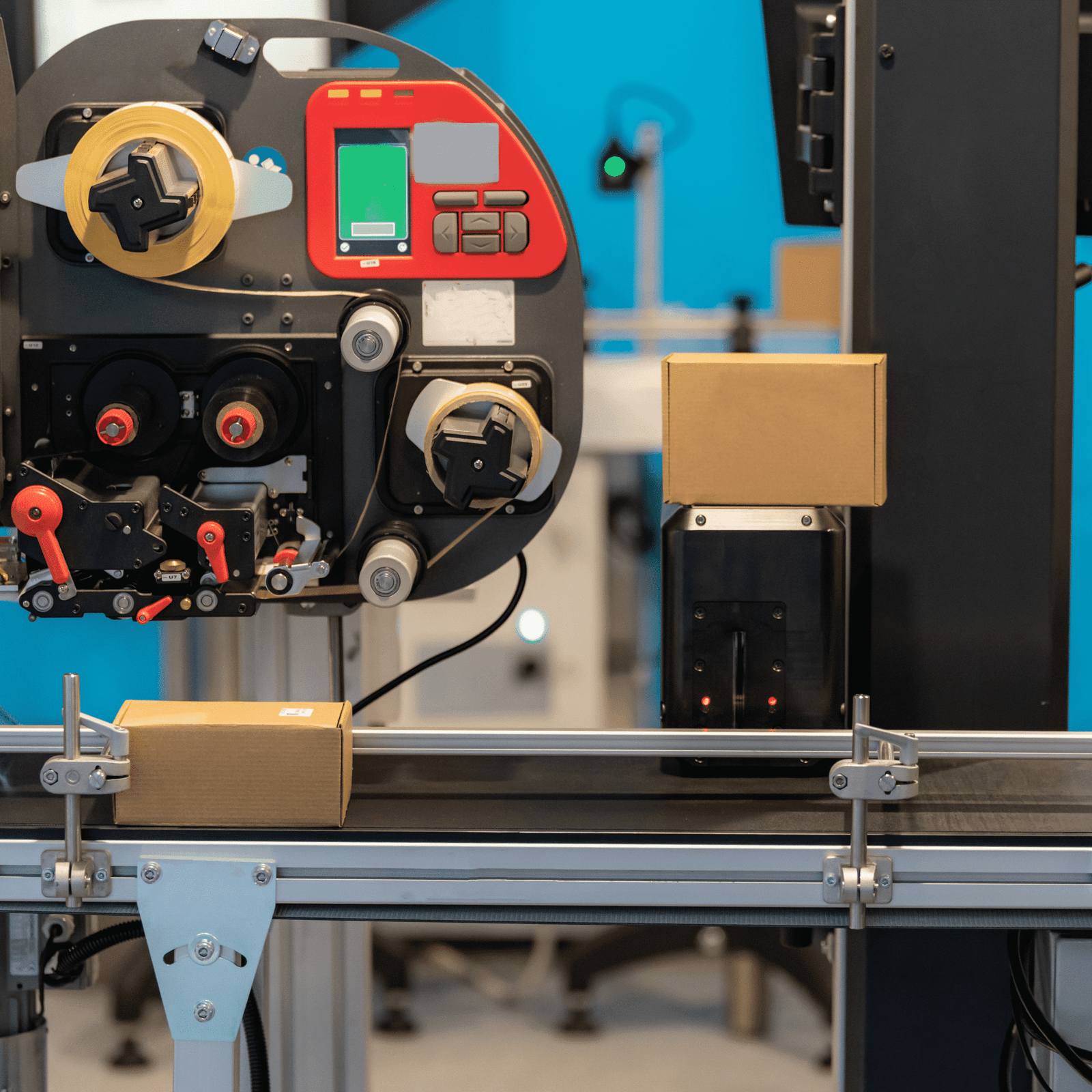
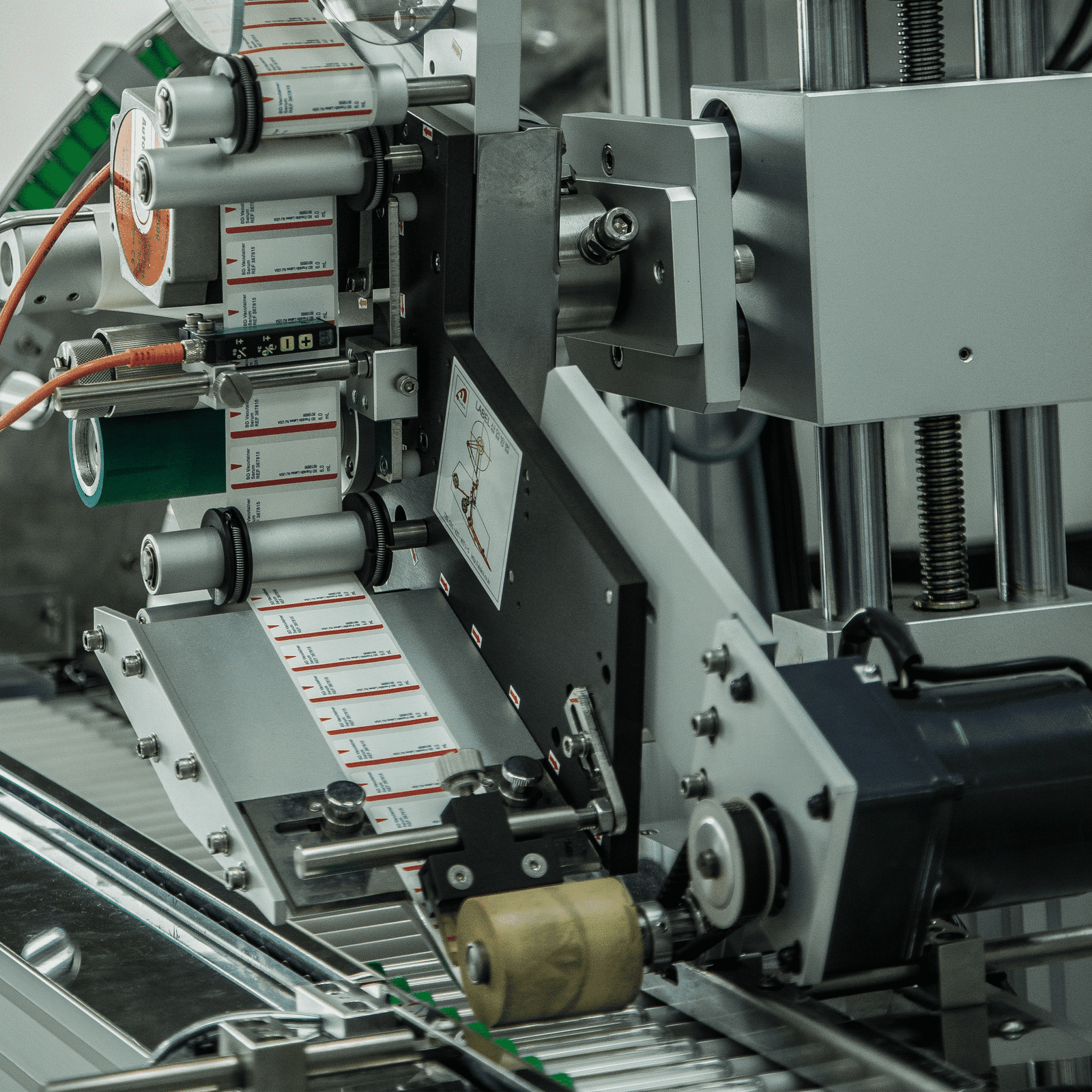
Here are the five key types of labelling machines to help you narrow down your search:

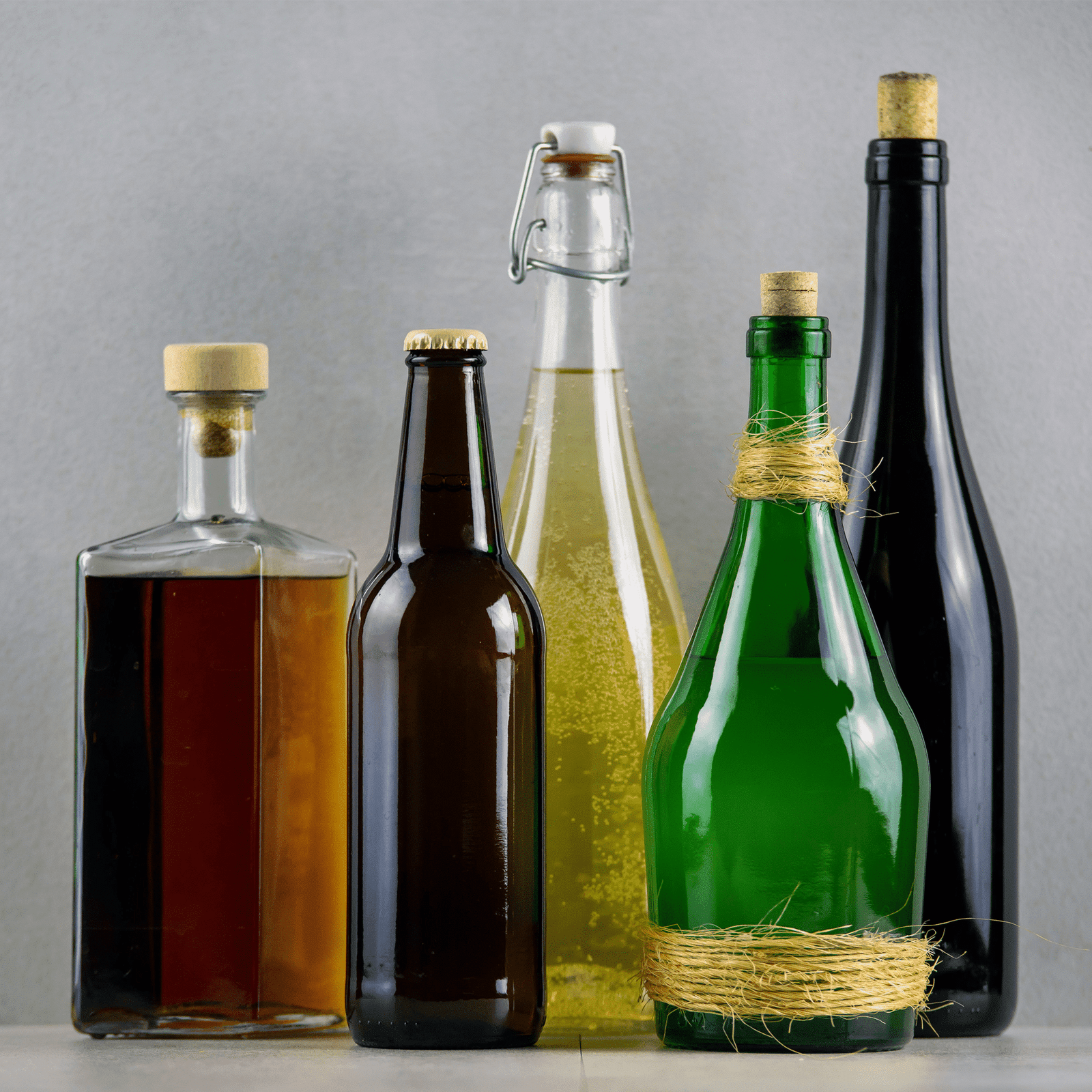
Hand labelling is a great way to get your products and business off the ground, but as your brand grows and sales increase, it can...

If you’ve never purchased a used labelling machine before, or you’re replacing an old one, it's critical you pick a supplier you can rely on.
These are three questions you should always ask before investing in a new bottle labelling machine:
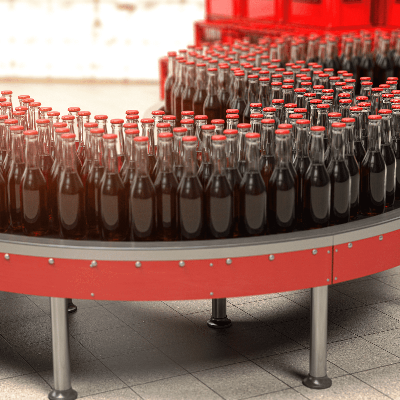
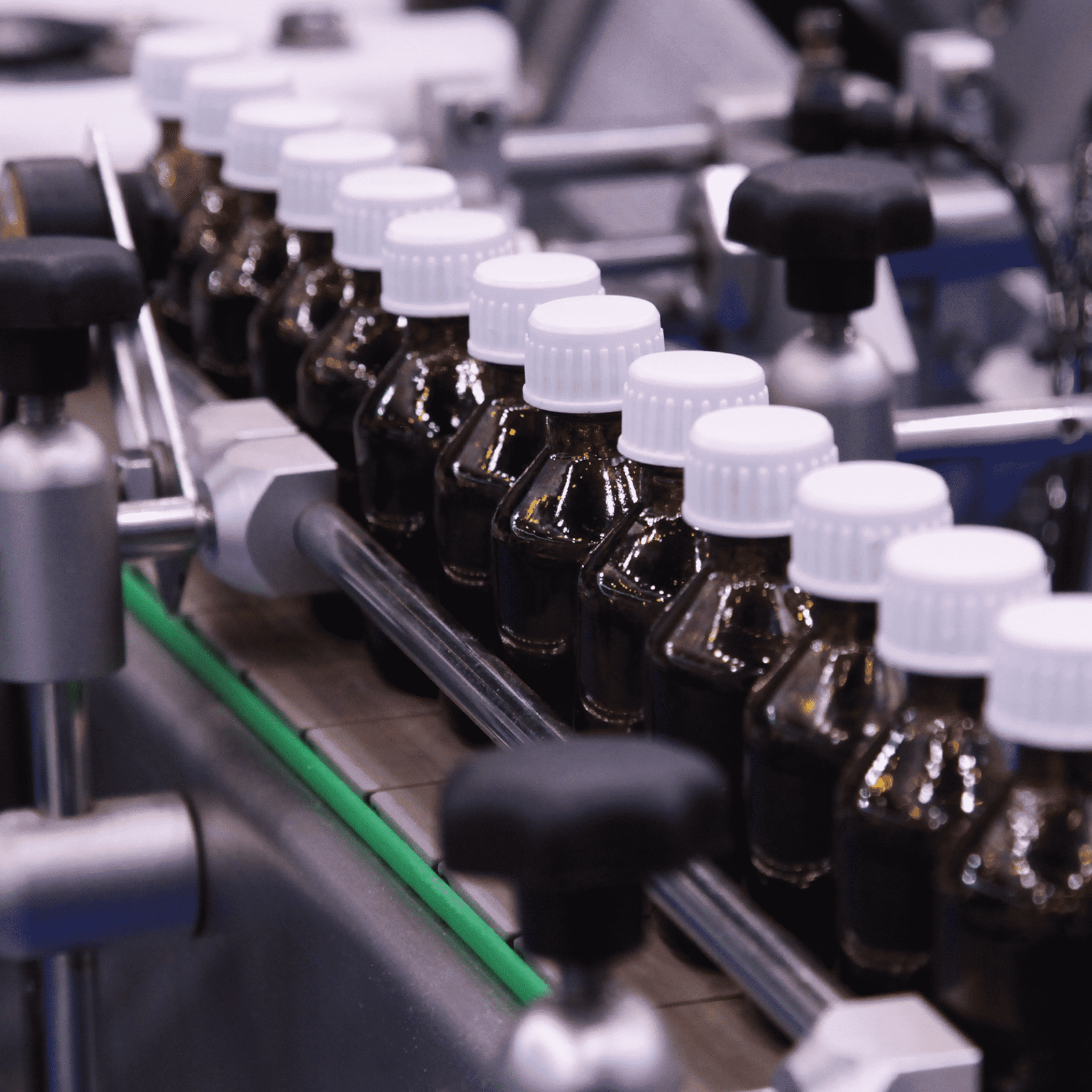
Businesses are wary of making the investment for an automatic labelling machine, it is important to understand the benefits they can bring.
We’re sharing our top five unique ways to use a labelling machine for your products:
Exploring how labelling machinery can help your business tackle the skills shortage and keep your production line running smoothly.
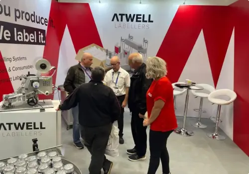
Atwell Labellers will be exhibiting at EmPack 2025 at the NEC, Birmingham, B40 1NT on the 12th and 13th of February, alongside our sister company,...